
Ink Perfection: A Comprehensive Pro’s Step-by-Step Guide to Applying Tattoos in Photoshop
Introduction: The allure of tattoos lies in their ability to express individuality, creativity, and personal narratives. In the realm of...
Introduction: The allure of tattoos lies in their ability to express individuality, creativity, and personal narratives. In the realm of...
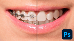
Introduction: A radiant, brace-free smile is often associated with confidence and positivity. In the realm of digital image editing, Photoshop...

Introduction: As the world navigates the digital age, virtual meetings and video conferences have become integral to our professional and...

Introduction: In the ever-evolving landscape of digital imaging, Adobe Photoshop has consistently been at the forefront, setting the standard for...

Introduction: Venture into the heart of design lushness as we embark on an exciting journey to create captivating Jungle Text...

Introduction: In the vibrant world of graphic design, the artful decoration of text is a dynamic and essential aspect that...

Introduction: In the realm of digital design, the marriage of text and dimensionality opens up a realm of creative possibilities....