


Mastering Windows Customization: A Comprehensive Guide to Personalizing the Appearance of Windows in Windows 7
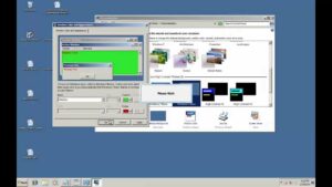
Windows 7, the beloved operating system by Microsoft, offers users a plethora of customization options to tailor the appearance of...
 How to Set Up a “Local-First” Freelance Portfolio Using Obsidian and Quartz for Maximum Speed
  The Best Upwork Niches for 2026: Why Cybersecurity Consulting is the New High-Paying Frontier
  How to Use “Agentic AI” to Automate Your Freelance Client Onboarding and Project Management
  The Legal Guide for Freelancers: How to Protect Your Creative Work from Being Scraped by AI Trainers
  How to Become an “AI Prompt Engineer” for Small Businesses: A Freelance Career Roadmap
 Windows 7, the beloved operating system by Microsoft, offers users a plethora of customization options to tailor the appearance of...
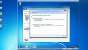
In the digital age, printers remain indispensable tools for transforming digital documents into tangible copies. Windows 7, Microsoft's renowned operating...
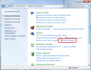
In the intricate ecosystem of computer hardware and software, device drivers play a crucial role in facilitating communication between hardware...
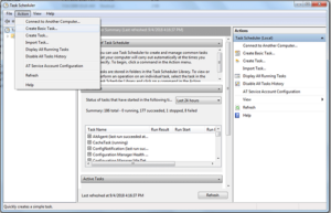
In the fast-paced world of computing, efficiency and productivity are paramount. Windows Task Scheduler, a powerful built-in utility of Windows...
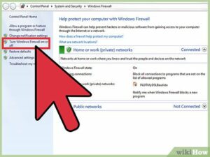
In the realm of cybersecurity, firewalls serve as critical barriers between your computer and potential threats from the outside world....
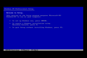
In the realm of computing, encountering system issues or errors is an inevitable part of the user experience. However, with...
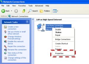
In the interconnected world of computing, sharing files and printers across a network is an essential aspect of collaboration and...