


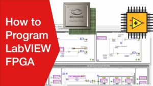
Mastering Hardware Programming with LabVIEW FPGA: A Comprehensive Guide
Introduction: LabVIEW FPGA (Field Programmable Gate Array) is a powerful tool for hardware programming, enabling engineers and developers to design...
 How to Use “Claude Code” to Build Custom Software Tools for Your Freelance Clients Without a CS Degree
  The Best Ergonomic Home Office Setup for Freelancers: Reducing Neck Pain and Eye Strain for Long Sessions
  How to Find International Clients Who Pay in Stablecoins: A Freelancer’s Guide to Crypto Payments
  Managing “Scope Creep” in the Age of AI: How to Price Freelance Services When Tools Make Work Faster
  How to Set Up a “Local-First” Freelance Portfolio Using Obsidian and Quartz for Maximum Speed
 Introduction: LabVIEW FPGA (Field Programmable Gate Array) is a powerful tool for hardware programming, enabling engineers and developers to design...
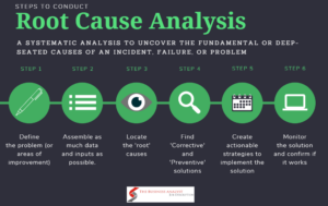
Introduction: Failure analysis is a critical process used across various industries to identify the root causes of failures in products,...
Introduction: In the realm of building safety and protection, designing effective fire protection systems is paramount. AutoSPRINK is a leading...
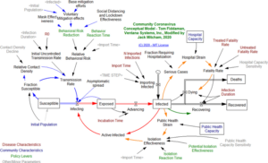
Introduction: System dynamics is a powerful methodology for understanding and modeling complex systems over time. Vensim, developed by Ventana Systems,...
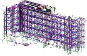
Introduction: Revit MEP is a powerful Building Information Modeling (BIM) software developed by Autodesk, specifically tailored for designing and simulating...
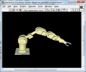
Introduction: Mechatronic systems, integrating mechanical, electrical, and software components, are ubiquitous in modern engineering applications, from robotics and automation to...
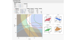
Introduction: Experimental design plays a crucial role in scientific research and industrial experimentation, enabling researchers and engineers to systematically investigate...