
Bringing Reality to Life: Creating Rotoscope-Style Paintings in Photoshop
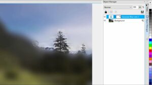
Combining reality with rotoscope-style painting in Photoshop offers a captivating and unique approach to digital artistry. By blending elements of...
Combining reality with rotoscope-style painting in Photoshop offers a captivating and unique approach to digital artistry. By blending elements of...

One of the most captivating aspects of digital artistry is the ability to manipulate light and shadow to create atmosphere,...
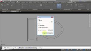
AutoCAD's Block Editor is a powerful tool that allows users to create, modify, and manage block definitions with precision and...
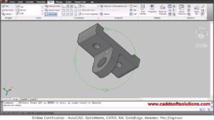
AutoCAD's 3D Orbit and View commands are indispensable tools for navigating and manipulating 3D models with ease and precision. Whether...
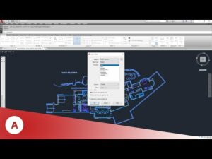
AutoCAD's Quick Select tool is a powerful feature that allows users to quickly and easily select objects based on specified...
Introduction: CorelDRAW stands as a cornerstone in the world of graphic design software, offering a plethora of tools and features...
Introduction: CorelDRAW stands as a beacon of creativity and innovation in the realm of graphic design software, offering a multitude...