How to use Windows Remote Assistance in Windows 8
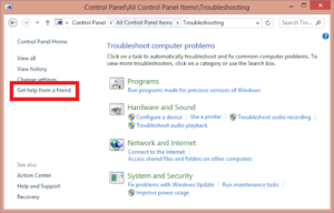
Windows Remote Assistance is a powerful feature built into Windows 8 that allows users to remotely connect to and assist...
Windows Remote Assistance is a powerful feature built into Windows 8 that allows users to remotely connect to and assist...
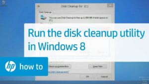
Windows Disk Cleanup is a valuable built-in utility in Windows 8 designed to help users free up disk space by...
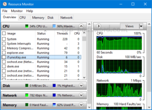
Windows Resource Monitor is a powerful system utility built into Windows 8 that provides detailed insights into the performance and...
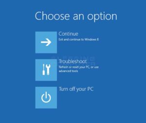
The Windows Recovery Environment (WinRE) is a vital feature built into Windows 8 that provides users with various tools and...
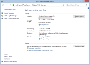
Using Windows Backup in Windows 8 is essential for safeguarding your data and ensuring that you can recover files and...
Windows 7, the beloved operating system by Microsoft, offers users a plethora of customization options to tailor the appearance of...
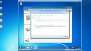
In the digital age, printers remain indispensable tools for transforming digital documents into tangible copies. Windows 7, Microsoft's renowned operating...