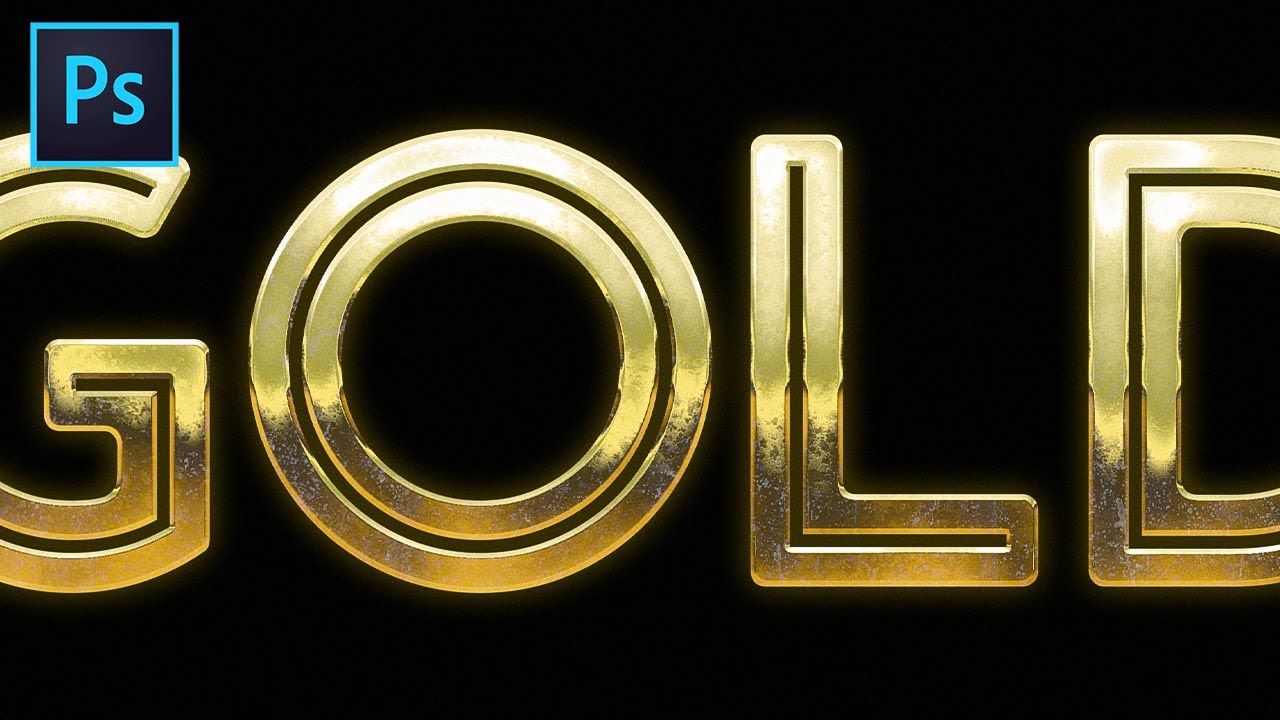
Gilded Mastery: A Comprehensive Guide to Creating a Gold Text Effect in Photoshop

Introduction:
In the vast realm of graphic design, mastering the art of text effects is a coveted skill, and among the most revered is the creation of a stunning gold text effect. Adobe Photoshop, a powerhouse in digital design, provides a versatile toolkit that allows designers to transform ordinary text into a gilded masterpiece. In this comprehensive guide, we will delve into the intricate steps and techniques required to achieve a captivating gold text effect in Photoshop, catering to both beginners and seasoned designers seeking to elevate their skills.
Understanding the Basics:
Before delving into the specifics of creating a gold text effect, it’s crucial to grasp the fundamental tools and concepts within Adobe Photoshop. Familiarity with layers, blending modes, and text formatting will form the foundation of our golden journey. As we embark on this creative endeavor, ensure that you have a basic understanding of Photoshop’s interface and tools to make the most of the tutorial.
Choosing the Right Font:
The first step in crafting a captivating gold text effect is selecting an appropriate font. While the choice ultimately depends on the project’s aesthetic and tone, consider opting for bold and elegant fonts that lend themselves well to the luxurious and opulent nature of gold. Serif fonts with intricate details or script fonts can often enhance the overall effect, providing a sense of sophistication.
Setting Up the Canvas:
Create a new document in Photoshop, ensuring that the canvas dimensions accommodate the desired size of your text. A high-resolution canvas is recommended for optimal quality, especially if the design will be used for print or large-scale applications. Establish a clean and organized workspace, setting the stage for the transformation from a blank canvas to a shimmering gold masterpiece.
Text Entry and Formatting:
Once the canvas is prepared, use the Text Tool (T) to input the desired text. Experiment with font size, spacing, and alignment to achieve a visually pleasing arrangement. Consider the overall composition of your design and adjust the text accordingly. For our gold effect, simplicity often works best, allowing the richness of the gold texture to shine through.
Layer Styles: The Key to Gilded Glory
Now comes the magic – layer styles. Access the Layer Style options by double-clicking on the text layer in the Layers panel or by selecting “Layer” > “Layer Style” from the top menu. Here’s where the transformation begins:
- Gradient Overlay: Start by applying a Gradient Overlay to the text. Choose a gold gradient that transitions seamlessly from light to dark, mimicking the reflective properties of real gold. Experiment with the angle and scale to achieve the desired effect.
- Bevel & Emboss: This is where the gold text truly takes shape. Adjust the Bevel & Emboss settings to add depth and dimension. Play with the angle, altitude, and size to create a three-dimensional appearance. Consider using a Chisel Hard technique for sharper edges that emulate the reflective quality of gold.
- Contour: Enhance the Bevel & Emboss effect by incorporating a Contour. This subtle addition adds finesse to the gold text, accentuating highlights and shadows. Experiment with different contour presets to find the one that complements your design.
- Texture: To impart a realistic texture to the gold, incorporate a texture overlay. Choose a texture that emulates the granular surface of gold, adjusting the scale and depth to suit your preferences. This step is crucial for achieving an authentic and visually appealing gold text effect.
- Color Overlay: Fine-tune the gold hue using a Color Overlay. This allows for additional customization, enabling you to experiment with different shades of gold or even introduce subtle undertones to match your overall design palette.
Refinement and Detailing:
With the primary layer styles in place, take the time to refine and detail your gold text effect further:
- Inner Shadow: Add an Inner Shadow to intensify the depth of the text. Adjust the angle and distance to enhance the overall realism.
- Drop Shadow: For an added touch of sophistication, incorporate a subtle Drop Shadow. Keep the opacity low to maintain a sense of subtlety and avoid overshadowing the intricate gold texture.
- Highlighting Edges: Use a soft brush with a low opacity to manually highlight the edges of the text. This step adds a personalized touch, emphasizing certain areas and enhancing the overall luminosity of the gold.
- Adjustment Layers: Experiment with Adjustment Layers, such as Curves or Levels, to fine-tune the contrast and brightness. This step ensures that your gold text seamlessly integrates into the broader design context.
Saving and Exporting:
Once satisfied with the gold text effect, it’s time to save and export your masterpiece. Choose the appropriate file format based on your project requirements, whether it be a high-resolution JPEG for print or a PNG with a transparent background for digital applications.
Conclusion:
Creating a gold text effect in Photoshop is a journey that merges technical prowess with artistic intuition. By mastering the intricacies of layer styles, texture overlays, and subtle detailing, designers can elevate their projects, infusing a touch of opulence and sophistication. With this comprehensive guide, both beginners and seasoned designers alike can embark on the golden path, transforming ordinary text into shimmering, gilded masterpieces that captivate and inspire.


