YouTube Music becomes more social by adding comments to the ‘Now Playing’ screen

YouTube Music has been recently updated and its “Now Playing” screen has got a fresh new look. One of the most notable changes is the new comments section. This allows the people read as well as write the comments from the app. The update has got the buttons that are very simple and easy to use. It also includes bigger pictures of album art cover as well as many more.
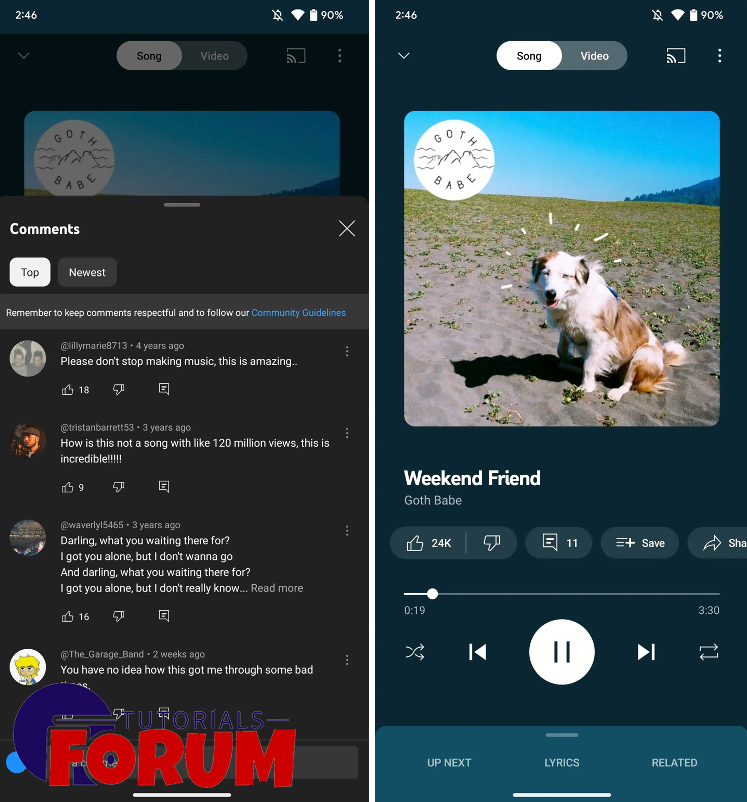
For those who are living under the rock and don’t know What YouTube Music is, it is a famous music streaming platform that lets its users to listen to a wide variety of music on YouTube. It is equipped with a wide collection of music tracks from different genres and artists, making is simple and easy for music junkies to discover new tunes and enjoy their favorite songs. The newly updated designs are for both Android and iPhone. YouTube Music has added new button for comments and the users can see what the ither people have said about official music video on YouTube. People can also write their own thoughts about the music which makes the app more interactive as well as social. The comments button can be seen under the album cover picture. When you will press it, a panel will pop up with the comments. Right next to the comments, there are some buttons for like or dislike the video, share it, save it, download it and listen to radio based on the song.
These buttons are hidden and they only show up when you tapped on the album cover. Moving the buttons under the song title makes them simple and easy to find. One of the minor changes is that the button to switch between the song and video is now white instead of similar color as the background. The redesign of YouTube Music comes after they launched ‘Samples’ which is a new feature that shows short videos similar to TikTok. Samples includes short videos of official music videos and the live performances from the collection of YouTube.


